Responsive Field Display Width allows to specify the width of each field during the form design step for optimal user experience. This feature helps to create form that appears correctly depending on the end-user's screen-size. In addition, the feature helps to create an optimal version for printing to save papers.
The following figures show the same form being viewed on mobile, tablet, desktop, and large desktop.
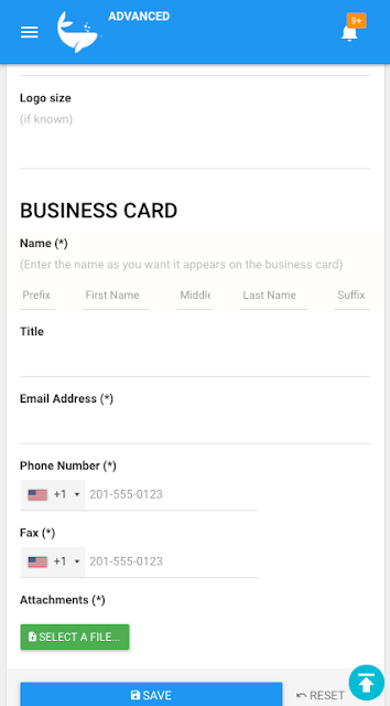 |
| Mobile |
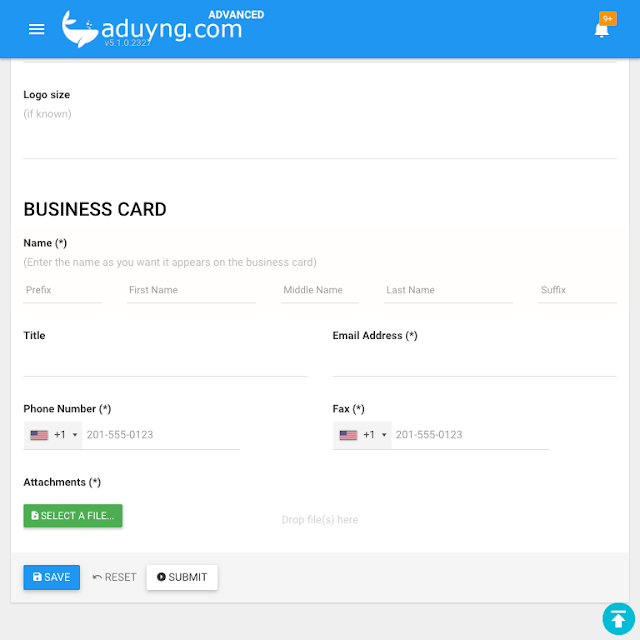 |
| Tablet |
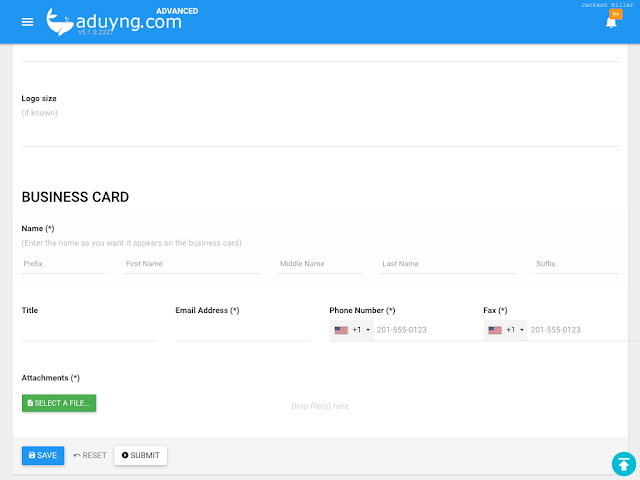 |
| Desktop |
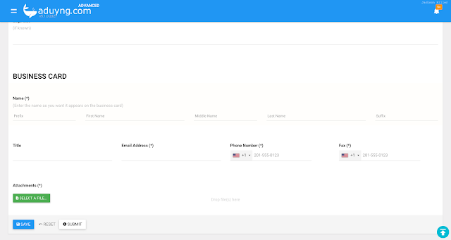 |
| Large desktop |
How to design
To specify the field width during the form design step, open the field "properties" panel, and select "SIZES" tab.
On this tab, select the size of the field for each screen-size: Mobile, Tablet, Desktop, Large Desktop. The size value uses 4-column grid, meaning value 1 equals to 25% of the device width, 2 equals to 50% of the width, 3 equals to 75% of the device width, and finally 4 equals to 100% of the device width.
TIP Note that the value for Tablet is also the value used when printing the form on A4 / Letter size paper.


No comments:
Post a Comment
Note: Only a member of this blog may post a comment.